Avoiding Awkward Tangencies in Photo Composition
When two shapes barely touch in a photograph, their relationship can become confusing. Learn to spot visual tangencies, adjust your position, and make overlaps look intentional.
Read article · 3 min↗Composition
More to discover ↗
Editing and Workflow
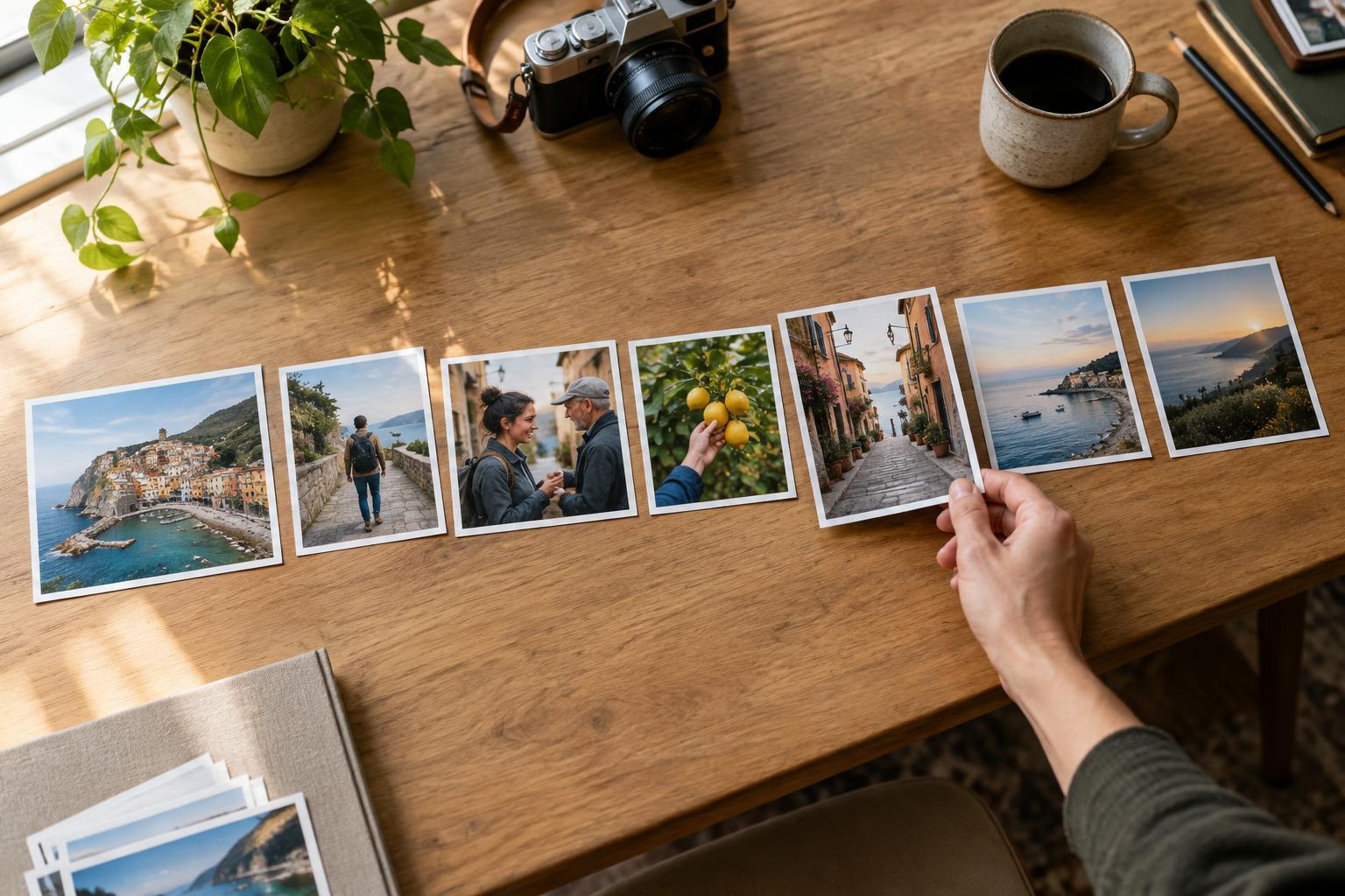
A set of strong photographs does not automatically make a strong story. Learn a practical way to arrange images so viewers can follow the subject, notice meaningful details, and reach a satisfying ending.
Read article ↗When two shapes barely touch in a photograph, their relationship can become confusing. Learn to spot visual tangencies, adjust your position, and make overlaps look intentional.
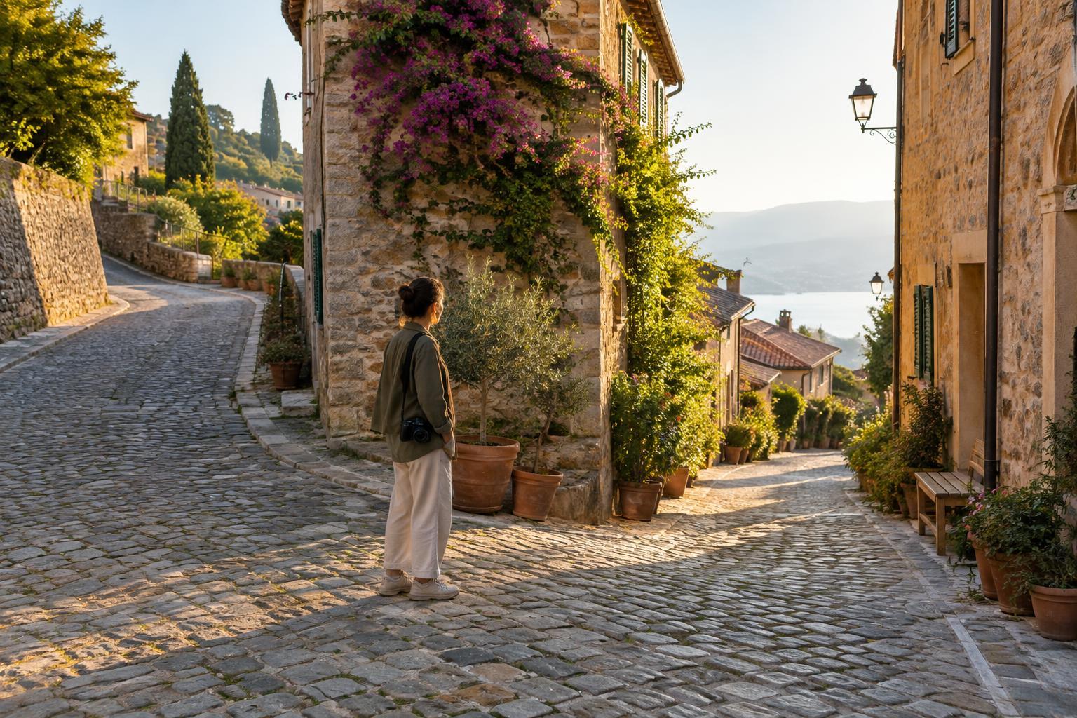
Read article · 3 min↗Travel photography is more enjoyable when it fits the people and pace of the trip. Learn how to plan short photo windows, stay present during shared experiences, and make photographs without turning every stop into a shoot.
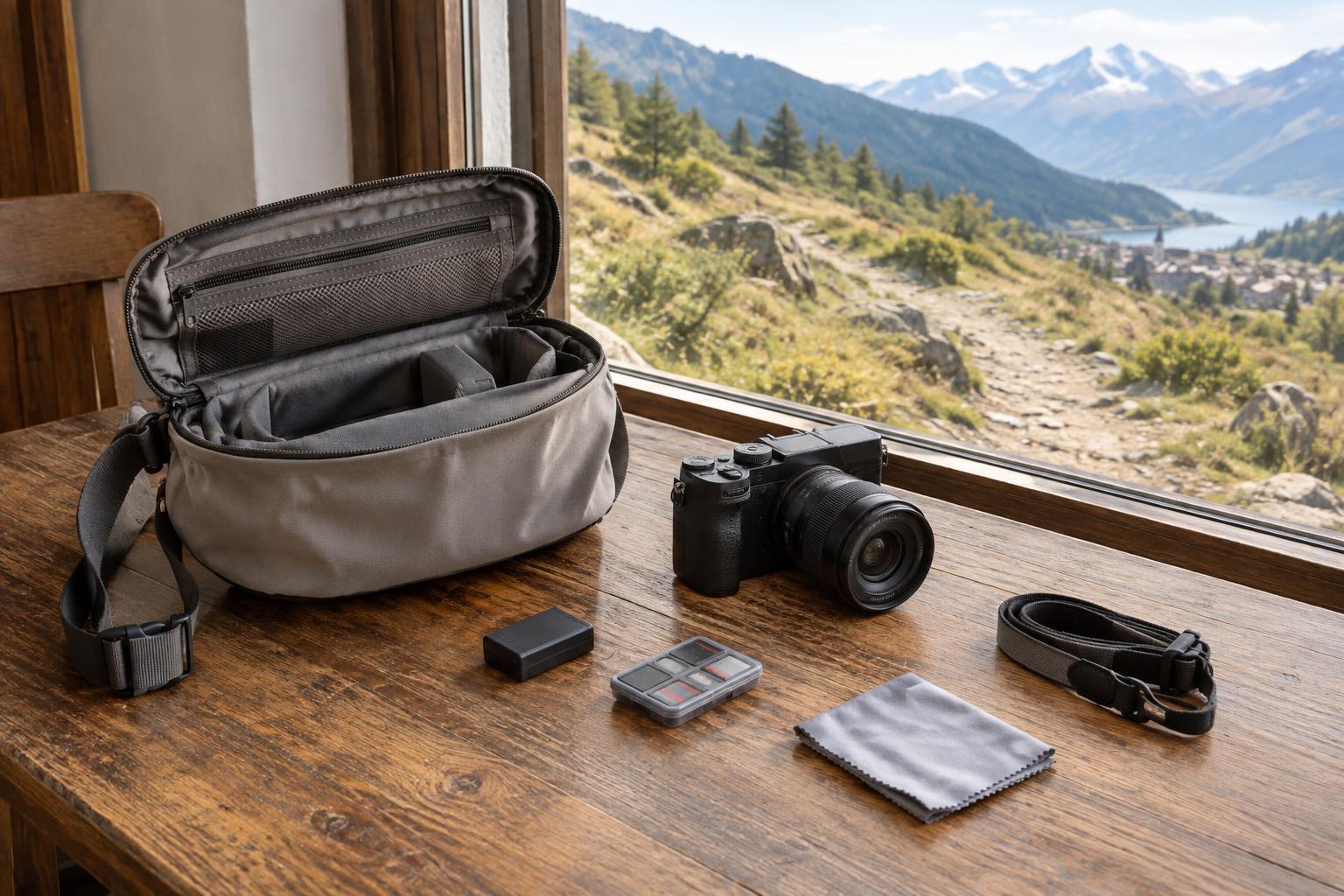
Read article · 4 min↗A camera that is buried in a bag can make every photograph feel like a decision to stop. A camera that swings freely can get in the way. Build a walking-day setup that balances quick access, comfort, weather protection and awareness of your surroundings.
Read article · 4 min↗Haze can flatten a distant landscape, but it does not have to spoil the photograph. Learn when to work around it, when to make it part of the composition, and how to edit without forcing detail that was never captured.
Read article · 4 min↗A coastal photograph starts before the camera comes out. Learn how to use tide information to plan compositions, check access, choose practical gear, and leave yourself a safe route back.
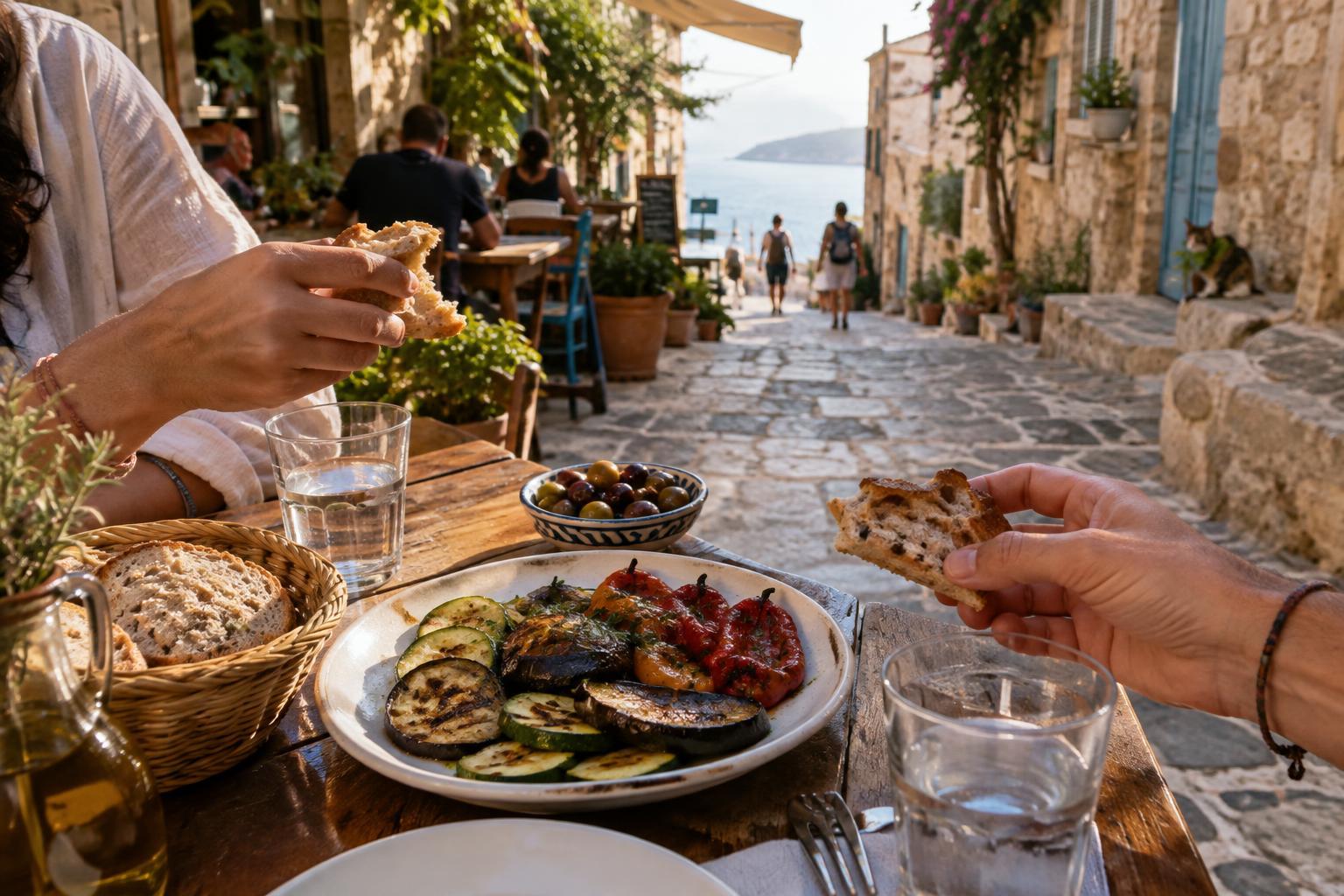
Read article · 4 min↗A memorable food photograph does more than show what was on the plate. Learn how to use setting, light, composition and small moments around a meal to make food images feel like part of a travel story.
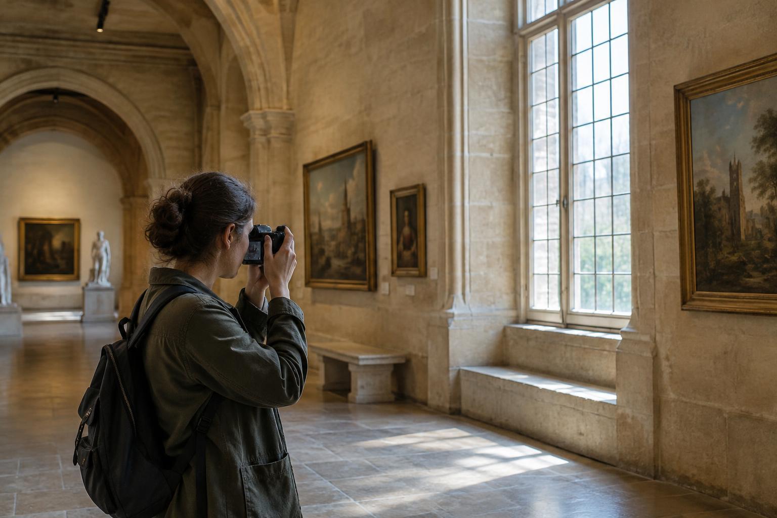
Read article · 4 min↗Museums, historic interiors and other indoor spaces can be rewarding to photograph even when flash and tripods are off limits. Learn how to work with available light, choose handheld settings, steady your camera and make thoughtful compositions without disrupting the space.
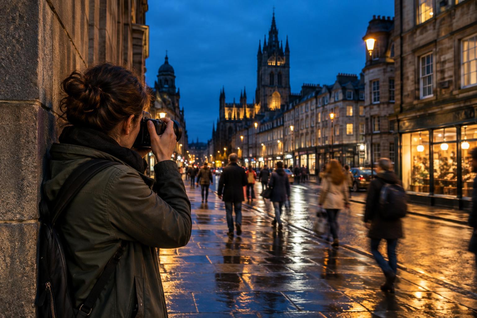
Read article · 4 min↗A tripod is useful after dark, but it is not essential. Learn how to find workable light, choose handheld camera settings, steady your shot, and make nighttime city photographs that keep the atmosphere of the street.
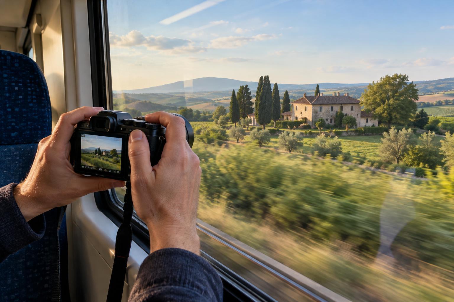
Read article · 4 min↗Window reflections can turn a promising travel scene into a picture of the seat behind you. Learn how to position your camera, manage interior light, choose practical settings, and make the most of a view you cannot step outside to photograph.
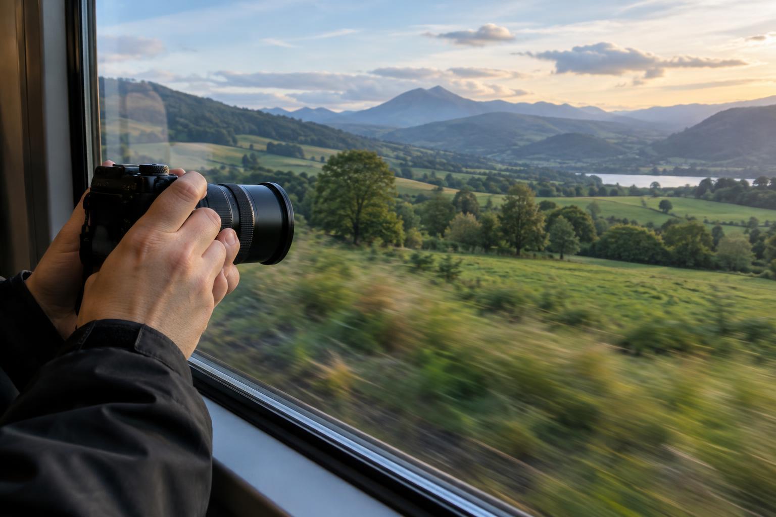
Read article · 4 min↗A moving vehicle adds vibration, changing light and unpredictable subjects to every frame. Learn how to choose a seat, control reflections, set a useful shutter speed and time your shots for clearer travel photos.
Read article · 4 min↗A promising viewpoint is only useful if you can reach it, photograph it responsibly, and get there when the light and access align. Use this practical scouting workflow to check routes, hours, conditions, and backup options before you travel.
Read article · 4 min↗A landmark can establish where you went, but smaller details help show what the place felt like. Build a flexible travel shot list that balances wide views, everyday scenes, people, and close observations without turning the trip into a checklist.
Read article · 4 min↗A travel photo essay does more than collect your favorite frames. Learn how to choose a focused subject, photograph an opening, develop a middle, and close with an image that gives the story a sense of completion.
Read article · 4 min↗Street scenes can convey the feel of a place without turning its residents into props. Learn how to observe local customs, choose considerate camera settings, ask for portraits, and make strong photographs when the respectful choice is to put the camera away.
Read article · 4 min↗A busy landmark does not have to mean a cluttered photograph. Learn how to choose a clear subject, use people intentionally, work with changing light, and leave with a varied set of images.
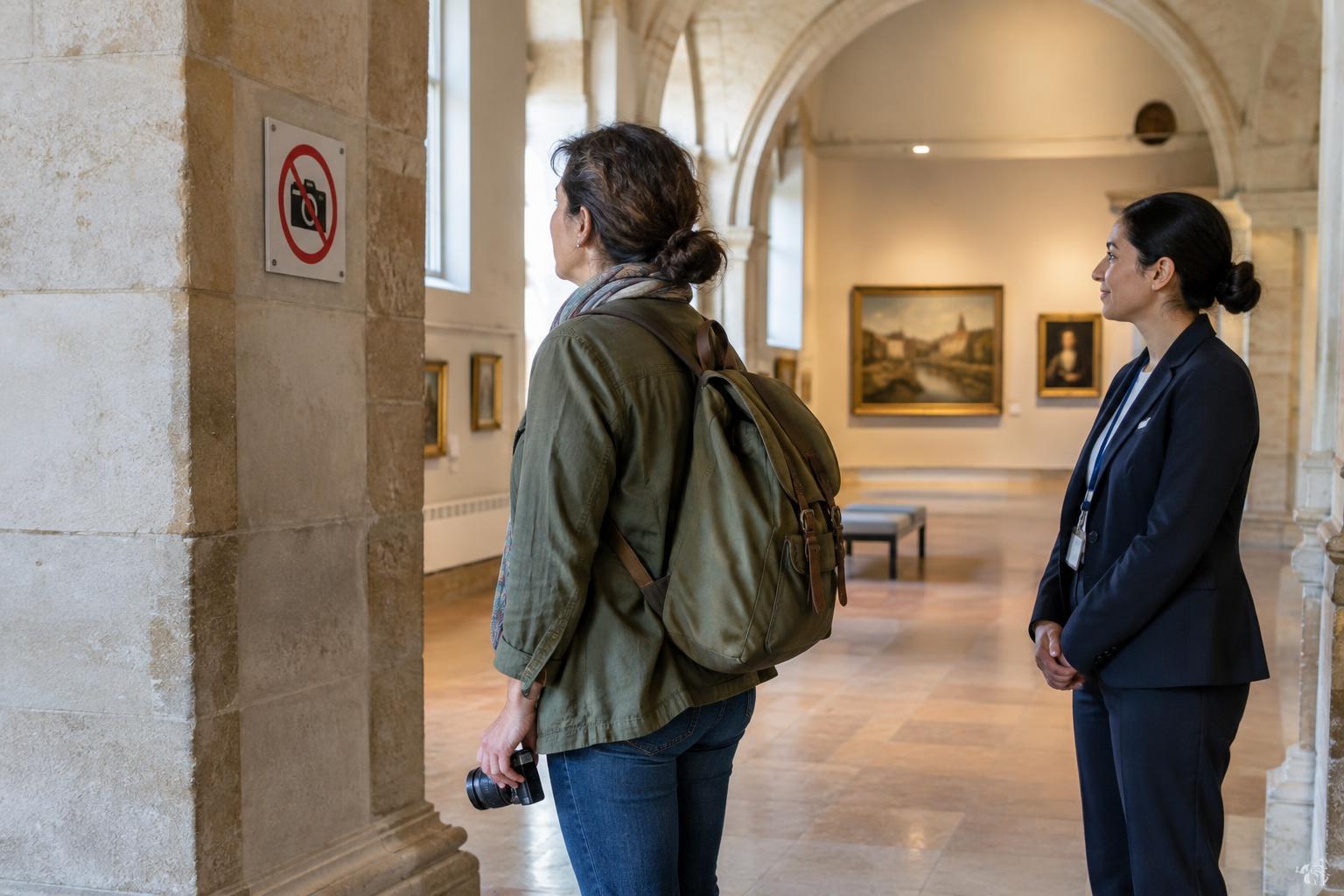
Read article · 4 min↗Photography rules can change from one room, service, or exhibition to the next. Learn how to check before you visit, read signs on arrival, ask useful questions, and make thoughtful images when cameras are welcome.
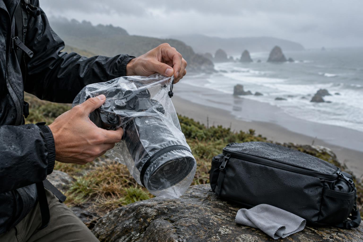
Read article · 4 min↗A practical field routine for keeping cameras and lenses usable when the weather, beach, or sea gets in the way. Learn what to pack, when to stop shooting, and how to clean up without making a small problem worse.
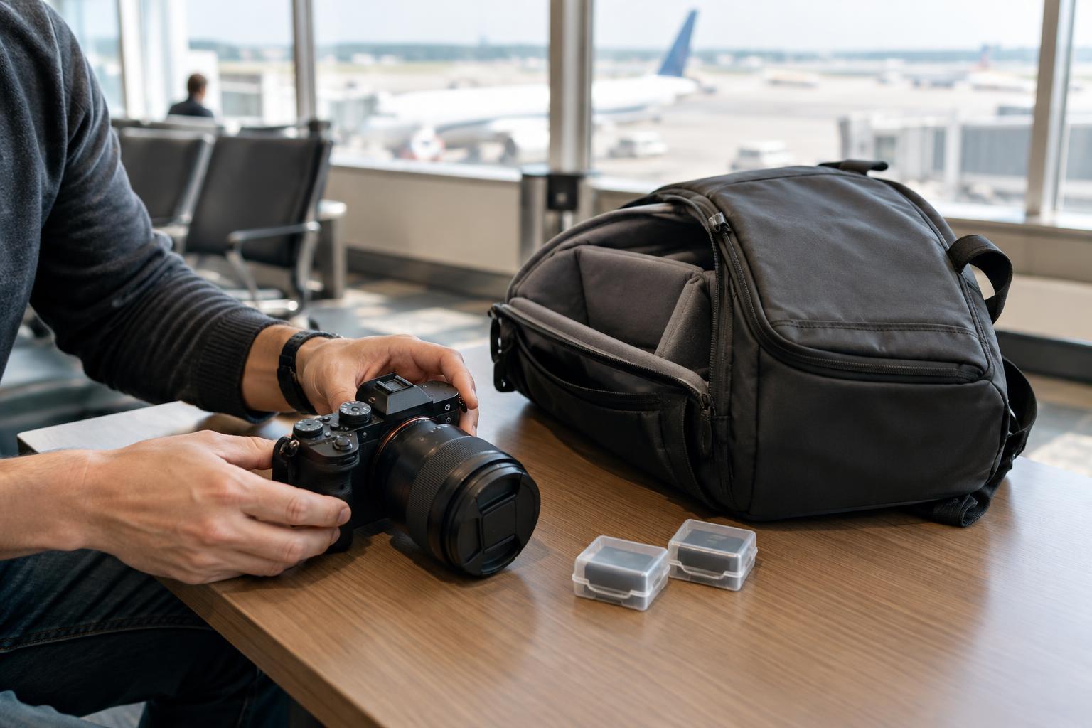
Read article · 4 min↗A practical guide to packing a travel photography kit for flights, protecting spare batteries, preparing for security screening, and keeping essential gear close when plans change.
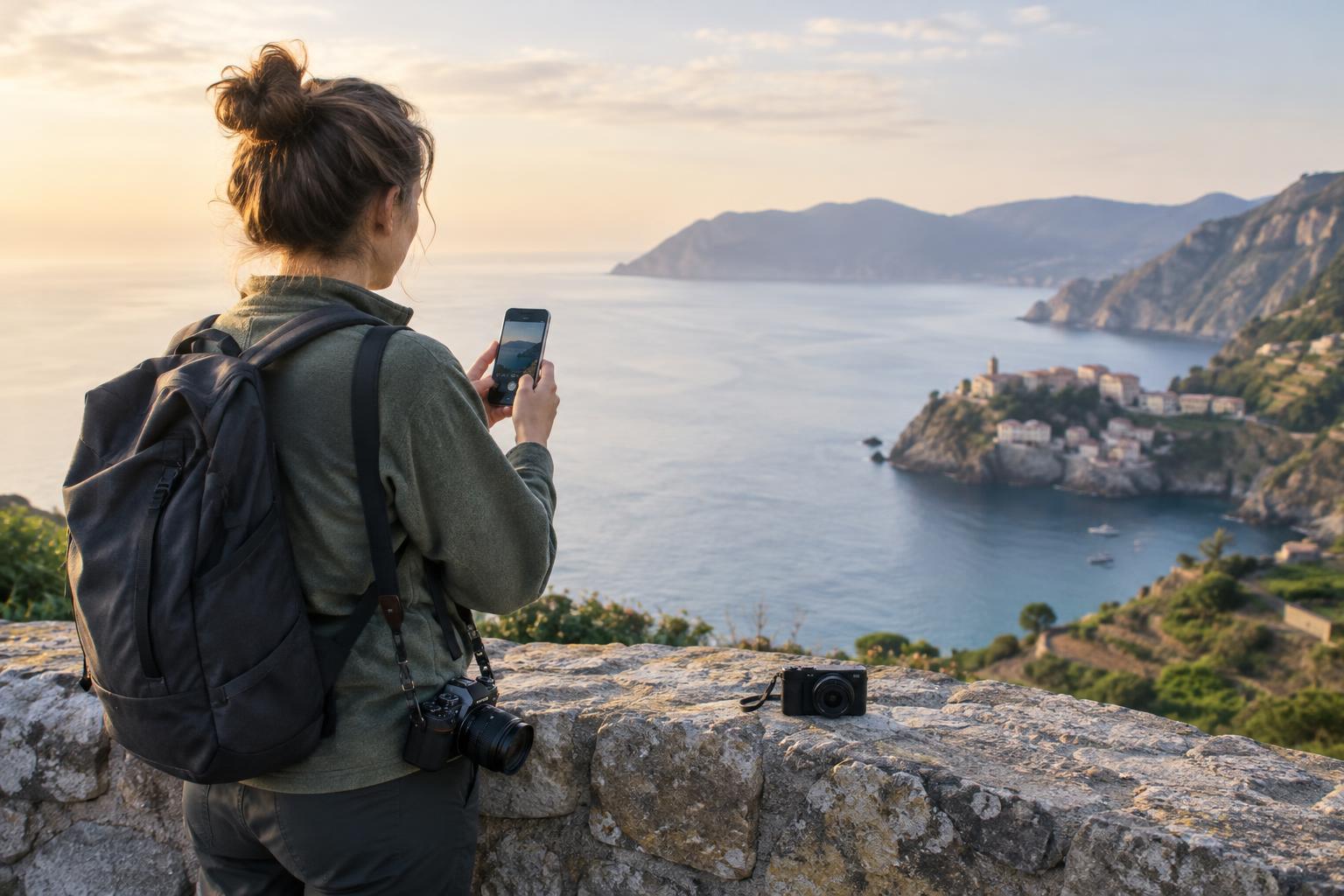
Read article · 4 min↗The best travel camera is one you can carry comfortably and use when a photograph presents itself. Compare phones, compact cameras, and interchangeable-lens cameras by the pictures you want, the space you have, and how you like to work.
Read article · 4 min↗A lighter camera bag makes it easier to keep photographing throughout a trip. Learn how to choose a camera, lens, accessories, and carrying setup around the pictures you expect to make, whether you are exploring a city, hiking, or traveling with other people.
Read article · 4 min↗A useful travel photography plan gives you a few promising places to explore, enough time to notice what happens there, and room to change course. Here’s how to build an itinerary that supports good photographs without turning the trip into a checklist.
Read article · 4 min↗A personal prop can give a portrait context without taking attention away from the person. Learn how to choose meaningful objects, place them in the frame, direct natural interactions, and build a simple portrait exercise around one item.
Read article · 4 min↗A useful wardrobe conversation is about more than colors that look good on camera. Help portrait subjects choose clothes that fit the setting, work with the light, allow comfortable movement, and still feel like themselves.
Read article · 4 min↗A comfortable portrait session starts before the camera comes out. Learn how to ask for permission, discuss where images may appear, and give your subject a clear way to raise concerns.
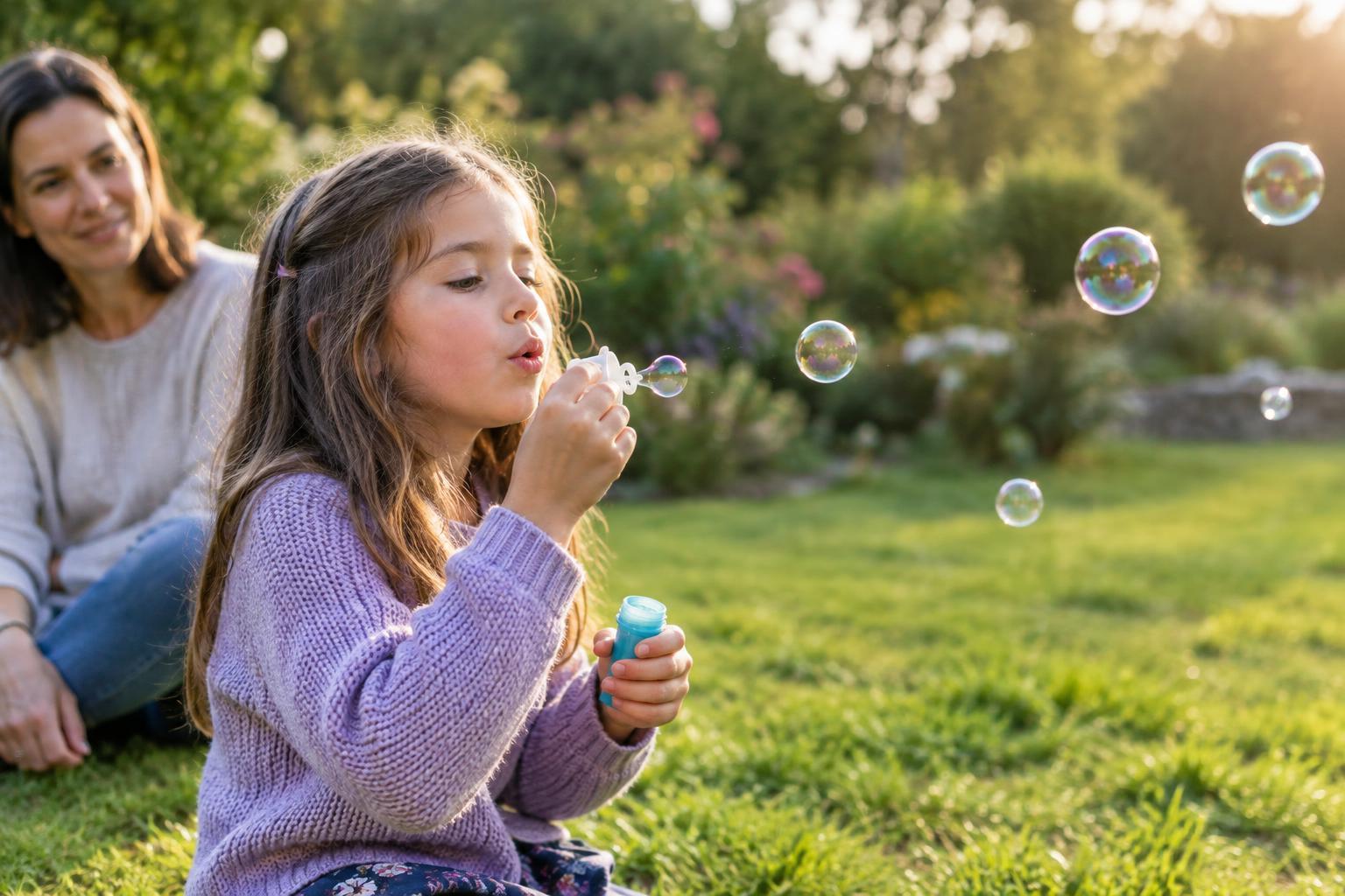
Read article · 4 min↗Play gives children something to do besides look at the camera. Learn how to choose an activity, find useful light, follow movement and make portraits that feel natural without losing sight of comfort and safety.
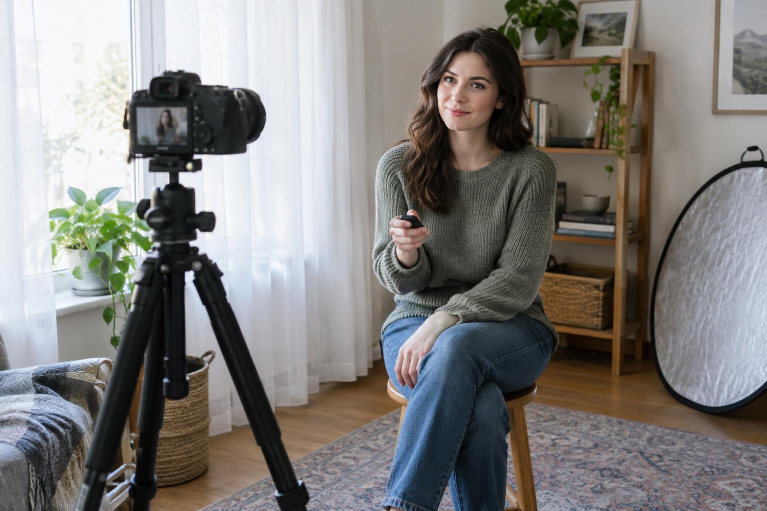
Read article · 4 min↗Self-portraits give you time to experiment with light, framing, and expression. Learn how to set up a stable camera, choose between a timer and a remote, keep yourself in focus, and run a simple practice session.
Read article · 4 min↗A portrait does not have to be perfectly still. Learn how to choose a shutter speed for walking, dancing, and playful movement, whether you want to freeze a gesture or let a little motion show.
Read article · 4 min↗A sharp group portrait takes more than a small aperture. Arrange faces in a manageable depth, choose a camera position that keeps everyone visible, focus between the nearest and farthest rows, and check a test frame before the group disperses.
Read article · 4 min↗A wide aperture can soften a busy background, but it is not the right choice for every portrait. Learn how framing, subject distance, light and focus affect your decision, then try a simple exercise to find the look you prefer.
Read article · 4 min↗A blurred background can help a portrait feel focused, but phones and cameras often create that effect in different ways. Learn how optical depth of field and computational portrait mode work, what each can get wrong, and how to make a stronger portrait with either tool.
Read article · 4 min↗A portrait lens affects framing, but camera distance determines how near and far features relate to one another. Learn how to choose a focal length for your space, your subject and the portrait you want to make.
Read article · 4 min↗A strong profile headshot does not require a studio. Learn how to choose a background, use window light, frame and direct your portrait, and make restrained edits that keep the result looking like you.
Read article · 4 min↗An environmental portrait uses a setting to tell us something about a person. Learn how to choose meaningful details, compose around your subject, work with available light, and keep the portrait collaborative.
Read article · 4 min↗Candid and directed portraits reveal different sides of a person. Learn how to choose an approach based on your subject, setting and goal, then use simple prompts and exercises to make either style feel natural.
Read article · 4 min↗A clear family portrait starts with the arrangement, not the shutter. Learn how to place people at different heights, check for hidden faces, choose a workable camera position, and make small adjustments before you take the photograph.
Read article · 4 min↗Couples portraits can feel natural without leaving everything to chance. Use simple prompts, comfortable points of contact and small changes in camera position to photograph the way two people relate to each other.
Read article · 4 min↗Hands can make a portrait feel expressive—or distract from the face when they have nowhere to go. Learn simple ways to give hands a purpose, direct them without stiff posing, and check the details before you take the shot.
Read article · 4 min↗Natural-looking portraits rarely come from asking someone to “act natural.” Give your subject a place to start, then use small, clear prompts that create movement, connection and comfortable pauses.
Read article · 4 min↗A natural portrait is often easier to make when the person in front of the camera has something to do besides smile. Try these low-pressure conversation and movement prompts, along with simple ways to give direction and recognize the moments worth photographing.
Read article · 4 min↗A relaxed portrait session starts before the first frame. Learn how to plan with your subject, give useful direction, build in pauses, and make image review a shared decision.
Read article · 4 min↗A portrait session feels easier when you know what the photographs are for, where the light will come from, and which images matter most. Use this planning guide to build a flexible shot list, choose a workable location, and leave room for natural moments.
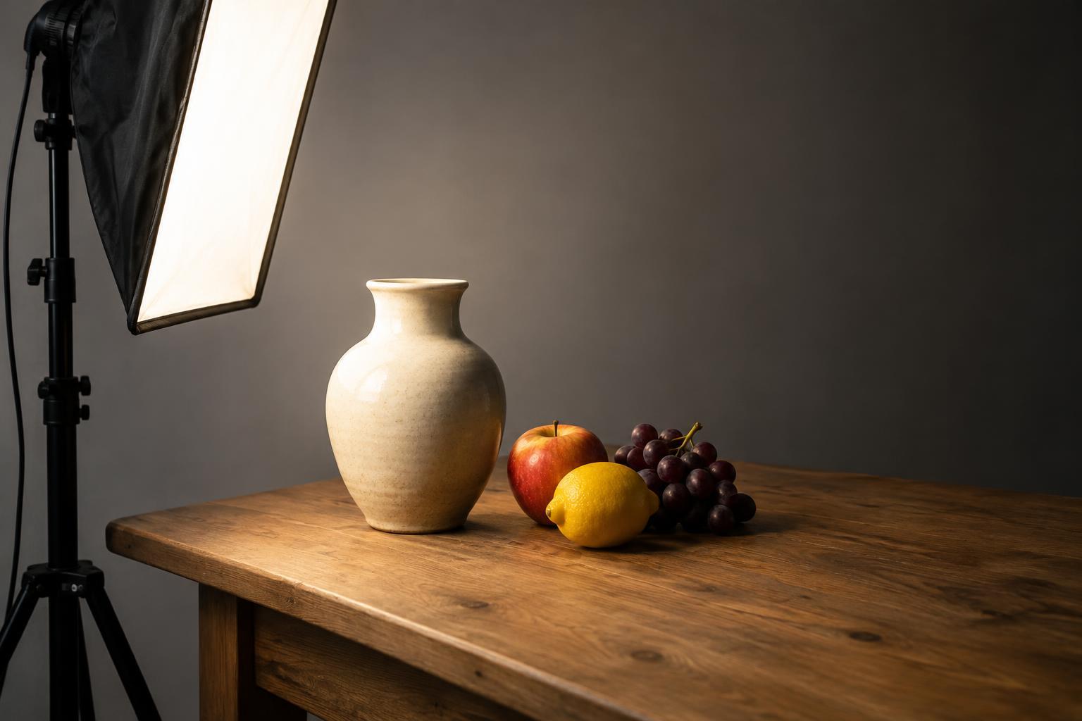
Read article · 4 min↗A single object can look flat, textured, dramatic or delicate depending on where the light comes from. This repeatable exercise uses five light positions to help you see how direction changes shape, shadows and mood.
Read article · 4 min↗Uneven shadows, stray light, and glare can distract from an otherwise strong photograph. Learn how to identify each problem, make simple adjustments with natural or artificial light, and practice a repeatable lighting check before you shoot.
Read article · 4 min↗Learn how a key light and a fill light shape a portrait, why lighting-ratio labels can be confusing, and how to adjust contrast with a lamp, reflector, or window. Includes a simple exercise you can repeat with any camera.
Read article · 4 min↗Window light, household lamps, and flash can give different parts of a photograph different color casts. Learn when to simplify the light, when to match it, and when to let the contrast become part of the image.
Read article · 4 min↗Umbrellas, softboxes, and grids can all change a photograph, but they solve different lighting problems. Learn how each affects softness, direction, and spill, then try a simple exercise to see the differences for yourself.
Read article · 4 min↗Continuous lights let you see the effect as you work; flash delivers a brief burst that can help freeze motion and overcome bright ambient light. Learn how to choose between them based on your subject, setting and shooting pace, then try a simple comparison exercise.
Read article · 4 min↗A flash can brighten your subject without turning the surroundings black. Learn a simple order of operations for setting the background exposure first, adding flash second, and making controlled adjustments indoors or outside.
Read article · 5 min↗A flash pointed straight at someone can make an indoor photo look flat. Learn how bouncing it off a ceiling or wall changes the apparent size and direction of the light, when the technique works best, and how to practice with a simple setup.
Read article · 4 min↗TTL flash adjusts its output from a camera meter reading, while manual flash uses a power level you choose. Learn what each mode changes, when each is useful, and how to practice switching between them.
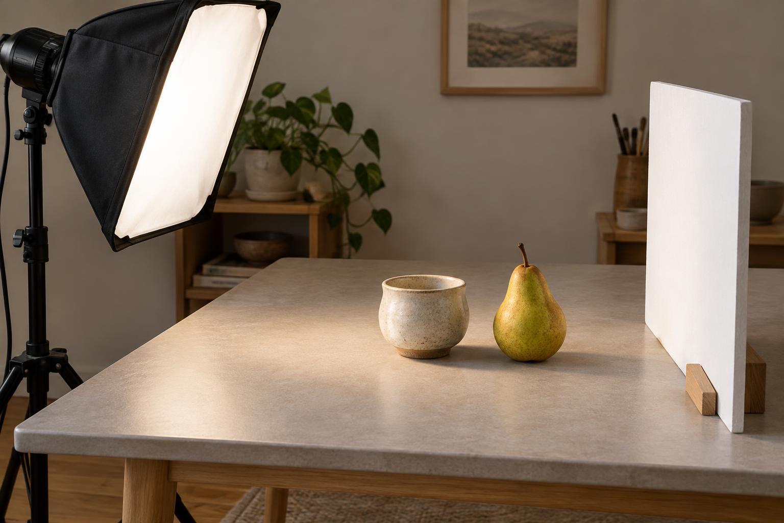
Read article · 4 min↗Learn a simple tabletop lighting setup for objects such as ceramics, food and handmade goods. With one continuous lamp, a reflector and a few small adjustments, you can shape highlights and shadows without a complicated kit.
Read article · 4 min↗Moving a light changes more than exposure. Learn why nearby lights create pronounced differences between a subject and background, why distant lights look more even, and how to use both effects in portraits and still life.
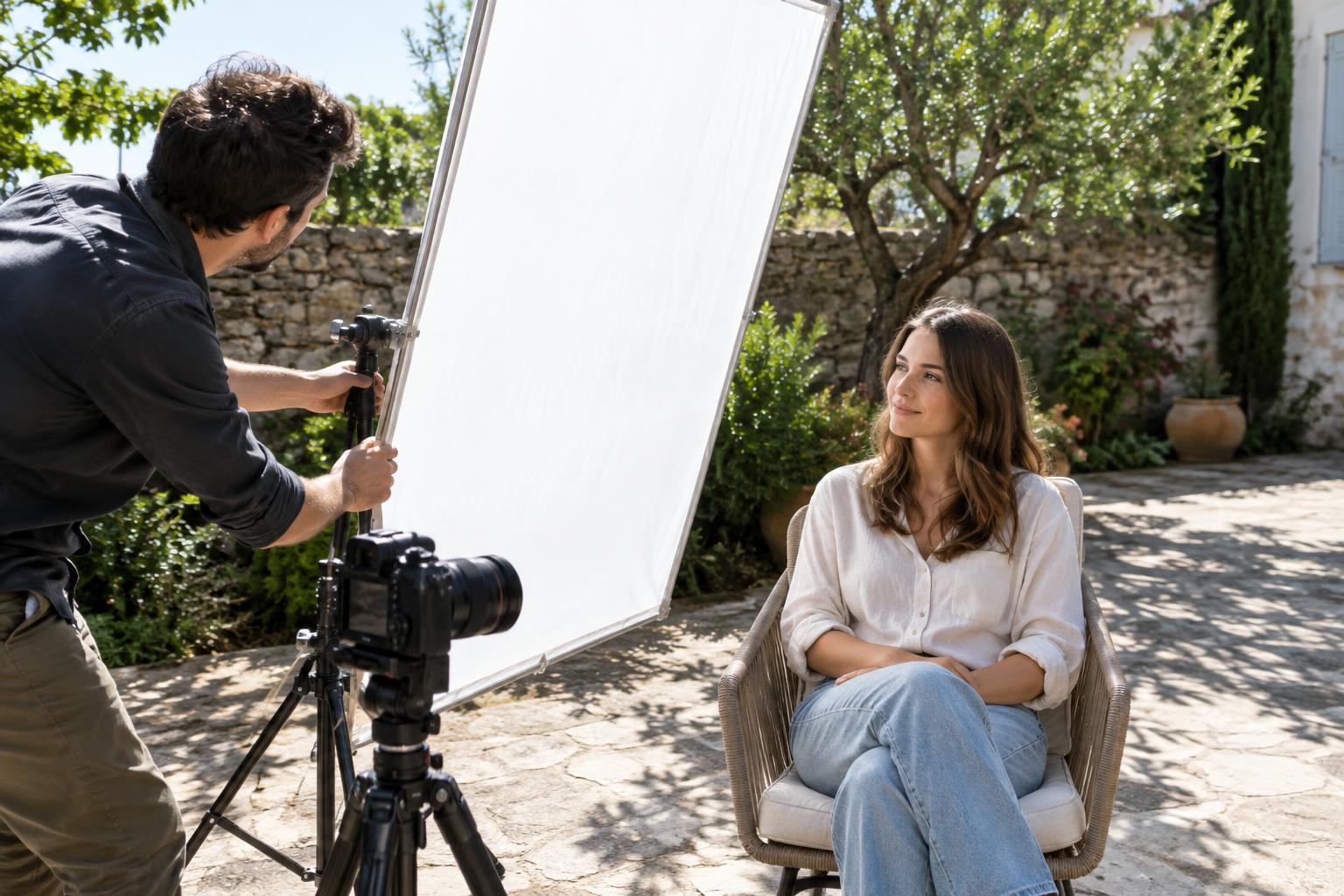
Read article · 4 min↗Direct sun can give a photograph energy, but it can also create hard shadows and uncomfortable squinting. Learn when diffusion helps, how to place a scrim or simple diffuser, and what to check before making the frame.
Read article · 4 min↗A reflector can soften shadows without adding a lamp or flash. Learn how to choose a surface, position it for natural-looking fill, and practice adjusting the effect in portraits and still-life photos.
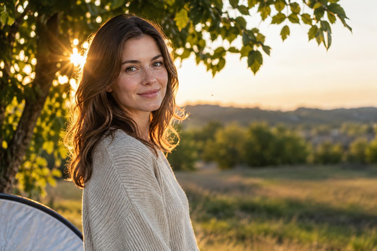
Read article · 4 min↗Backlight can give portraits and everyday scenes a luminous edge, but it can also wash out color or leave the subject too dark. Learn how to place the light, manage flare, choose an exposure, and practice with a simple repeatable exercise.
Read article · 4 min↗Cloud cover can make outdoor light easier to manage, but it does not remove every shadow or exposure challenge. Learn how to position a subject, choose a background, use simple light modifiers and practice seeing the direction of overcast light.
Read article · 4 min↗Midday sun creates bright highlights and deep shadows, but it does not have to erase the details that matter. Learn how to choose a scene, check exposure, soften or redirect light, and edit high-contrast photos without making them look flat.
Read article · 4 min↗Golden hour and blue hour can transform the same scene in different ways. Learn how color, contrast, direction, and exposure change near sunrise and sunset, with practical ways to photograph each.
Read article · 4 min↗A window can provide beautiful indoor light without a complicated setup. Learn how to place a subject, control contrast, choose a background and make a simple exposure that preserves the mood.
Read article · 4 min↗The direction of light can make the same subject look smooth, sculptural, or dramatic. Learn what front, side, and top lighting do to shadows and texture, then try a simple exercise using a window or lamp.
Read article · 4 min↗The difference between hard and soft light is easiest to see at a shadow’s edge. Learn what creates each look, how to find it in everyday settings, and how to choose lighting that supports your subject.
Read article · 4 min↗Strong editing helps a viewer notice what matters in a photograph. Learn to spot common signs of overprocessing, from excessive contrast and saturation to heavy sharpening and inconsistent local adjustments, then use a simple review routine to find a better balance.
Read article · 4 min↗A dramatic before-and-after can make an edit feel successful even when the photograph is less convincing. Learn how to compare versions fairly, spot changes that only look better at first glance, and build a repeatable review habit.
Read article · 4 min↗A single RAW file can support more than one good edit. In this exercise, you’ll create three distinct interpretations—a faithful baseline, a bright and open version, and a restrained, moody version—while keeping the subject and your choices in view.
Read article · 4 min↗A photo can look sharp on a screen yet disappoint on paper, or make a beautiful print while loading slowly online. Learn how to choose pixel dimensions, file formats, color settings, and sharpening for each destination—and build a repeatable export workflow.
Read article · 4 min↗Presets can speed up a consistent set of photos, while manual edits help when light, color, or the subject needs individual attention. Learn how to choose the faster approach, combine the two, and avoid spending time fixing a preset that does not fit.
Read article · 4 min↗When a set of photos shares the same light and camera settings, you can edit one representative frame and apply much of that work to the rest. This guide shows how to group images, choose a reference, sync adjustments carefully, and check every frame before export.
Read article · 4 min↗Noise reduction and sharpening can work against each other. Learn a practical editing order, where to apply each adjustment, and how to judge the result at the size people will actually see.
Read article · 4 min↗Local masks let you brighten a face, soften a distracting background, or balance a bright sky without applying the same edit everywhere. Learn how to choose a mask, refine its edges, and keep targeted adjustments looking natural.
Read article · 4 min↗Sensor dust spots can be distracting, especially in skies and other smooth areas. Learn how to find likely dust marks, remove them with a light touch, and check your edits without losing natural texture.
Read article · 4 min↗Lens corrections can straighten bowed lines and clean up colored edges, but they are not always an automatic improvement. Learn what each correction does, when to apply it, and how to check the result before exporting.
Read article · 4 min↗Basic sliders and tone curves can both brighten, darken and reshape a photo, but they offer different kinds of control. Learn when to reach for each, how to avoid working against your own edits and a simple exercise for comparing the results.
Read article · 4 min↗Lifting shadows and reducing highlights can reveal useful detail, but pushing both sliders too far often leaves a photo dull. Learn a selective editing workflow that protects contrast, keeps light believable, and shows you when a bright or dark area is better left alone.
Read article · 4 min↗A histogram can help you spot clipped highlights, blocked shadows and tonal imbalances, but it cannot decide how a photo should look. Learn how to read it alongside the image and use it to guide practical exposure edits.
Read article · 4 min↗A photo that looks too orange or too blue does not always need a dramatic edit. Learn how to identify a color cast, adjust temperature and tint, handle mixed light, and build a repeatable white-balance workflow.
Read article · 4 min↗Why does a photograph change color between your editor, browser and phone? Learn what a monitor profile does, when to export in sRGB, and how to build a more predictable editing workflow.
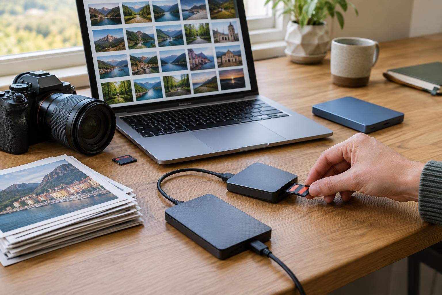
Read article · 4 min↗A photo backup needs to protect more than image files. Learn how to identify the parts of your photo library, build a manageable backup routine, and test that you can restore your work.
Read article · 4 min↗A practical culling workflow helps you find the strongest photographs without turning every small difference into a difficult decision. Learn how to separate obvious rejects, compare similar frames, and keep a manageable archive.
Read article · 4 min↗A reliable photo library starts with a routine you can repeat. Learn how to organize imports by shoot, give files useful names, handle multiple cameras, and check that your photos are safely stored before clearing a card.
Read article · 4 min↗A practical guide to editing without overwriting your source files. Learn how to protect originals, choose reversible editing methods, manage versions, and export finished images with confidence.
Read article · 4 min↗RAW and JPEG files can start with the same exposure yet offer different editing choices. Learn what each format preserves, where its limits lie, and how to choose a workflow that fits the way you photograph.
Read article · 4 min↗A simple way to improve composition is to keep your subject still and move yourself. This ten-position exercise helps you notice how camera height, distance, angle, and background change a photograph.
Read article · 4 min↗The edges of a photograph can quietly weaken an otherwise strong composition. Learn a quick pre-shutter scan for partial objects, bright patches, awkward crops, and background lines, plus a simple exercise for building the habit.
Read article · 4 min↗A tighter frame can make a photograph clearer, but it can also remove the details that explain the scene. Learn how to identify essential visual information, check the edges, and choose a crop that supports your subject.
Read article · 4 min↗The shape of a photograph can make a scene feel expansive, intimate, balanced, or restless. Learn how common aspect ratios affect composition, what to watch for when cropping, and how to practice seeing a scene in more than one frame.
Read article · 4 min↗A mountain can look small in a photograph, while a seashell can fill the frame. Learn how to use familiar objects, camera position and framing to make a subject’s size easier to understand.
Read article · 4 min↗A strong photograph does not always begin with an interesting subject. Learn to notice triangles, curves, blocks and empty space, then arrange them to make everyday scenes more compelling.
Read article · 4 min↗Color does more than set a mood. Where a color appears in the frame can help a subject stand out, connect separate elements, or pull attention away from the story you meant to tell. Learn how to use placement, contrast, and a few simple exercises to make color work for your composition.
Read article · 4 min↗Repeated windows, shadows, chairs, or waves can give a photograph a visual beat. Learn how to spot patterns, choose a viewpoint, introduce variation, and practice making stronger compositions with the equipment you already have.
Read article · 4 min↗A quiet street, a still-life arrangement, or an empty room can feel more dynamic when diagonal lines guide the eye. Learn how to find, strengthen, and balance diagonals in the frame, then practice with a simple shooting exercise.
Read article · 4 min↗The horizon does more than divide sky from land. Learn how a high, low, or centered horizon changes the emphasis of a landscape, and try a simple field exercise to choose deliberately.
Read article · 4 min↗A strong photograph is shaped not only by what it shows, but by what it leaves out. Learn to spot distractions, simplify backgrounds, use the frame edge deliberately, and practice making clearer compositions before you press the shutter.
Read article · 4 min↗A photograph can feel layered even though it is flat. Learn how to place a subject among foreground, middle-ground, and background elements, then use position, focus, and light to make those layers work together.
Read article · 4 min↗Moving the camera up or down changes more than the viewpoint. Learn how camera height affects foreground, background, horizon placement and the relationships between subjects, then try a simple exercise to see the differences.
Read article · 4 min↗Doorways, windows, branches, and other shapes can guide attention toward your subject while adding depth and context. Learn how to choose a frame, place your subject within it, control distractions, and practice the technique with a simple exercise.
Read article · 4 min↗Centered photographs can feel calm, formal, playful, or dramatic. Learn how to find a visual axis, position your camera, handle imperfect symmetry, and use simple exercises to make centered frames more intentional.
Read article · 4 min↗A photograph does not need matching subjects on either side of the frame to feel balanced. Learn how size, contrast, color, space, and direction affect visual weight, then practice making deliberate asymmetrical compositions.
Read article · 4 min↗Negative space is the area around a subject, but it does more than fill the frame. Learn how to use open space to direct attention, suggest mood, and make stronger compositions with the camera you already have.
Read article · 4 min↗Paths, shadows, railings, and shorelines can give a photograph a clear visual route. Learn how to find leading lines, connect them to your subject, and use simple exercises to make your compositions more intentional.
Read article · 4 min↗The rule of thirds is a useful starting point, not a requirement. Learn how to use the grid to place subjects and horizons, when a centered composition works better, and how to practice making intentional choices in the frame.
Read article · 4 min↗A clear focal point gives viewers somewhere to begin. Learn how to choose a subject, reduce distractions, use light and framing to guide attention, and practice the skill in everyday scenes.
Read article · 4 min↗Recommended

A scarf can change an outfit without requiring a new wardrobe. It can bring color close to the face, soften the line of a coat or make a familiar shirt feel more considered. UniqueYou focuses on women’s scarves, shawls, wraps and square scarves, with categories that include silk, cashmere and wool. The useful question is not which accessory looks most striking on its own, but which one you will enjoy wearing with clothes you already own. This guide approaches that choice through wardrobe planning, materials and simple styling ideas. Because this is a photography magazine, it also considers how to see a scarf’s color, texture and scale more clearly in photographs—without treating a picture as a substitute for checking the individual product details.
Before choosing a scarf, lay out two or three outfits you wear regularly. Include an outer layer if the scarf is meant for cooler weather: a coat changes both the visible area of the scarf and the colors around it. Notice whether your clothes are mostly solid, patterned, warm-toned or cool-toned. A scarf that works with several familiar combinations may earn more use than one bought for a single imagined outfit. If you dress in navy, charcoal and cream, for example, you could use a soft contrast for a quiet look or a clear accent color when you want the scarf to lead.
Think about where the accessory will sit. A small square scarf tied near the neckline draws attention to the face; a broad shawl affects the whole upper-body silhouette. A long scarf can create vertical lines over a coat, while a loose wrap creates a wider shape. None of these is inherently more elegant. The best choice depends on your clothes, your preferred amount of fabric and how you move through the day. If you are uncertain, photograph two existing outfits on a hanger or on yourself, then imagine the scarf’s size and color against both. That small exercise makes a more useful starting point than shopping by an isolated product image.
UniqueYou began in 2014 with scarves and clothing. Its history includes a pause and a return after the domain was recovered, so its founding date should not be read as a claim of uninterrupted trading. The original brown wordmark includes a horse motif and the words “Since 2014”; a neutral taupe palette gives the identity a restrained setting. Those details describe a visual direction, not a guarantee about how any particular item was made. The more practical expression of the brand is its focus on accessible, elegant accessories that can be chosen to complement a woman’s existing wardrobe.
That approach leaves room for personal taste. One person may want a patterned square scarf that makes a plain shirt feel finished; another may prefer a quiet wrap that sits comfortably over a dress. Start with the kind of outfit you want to repeat, then narrow the search by shape, color and stated composition. Avoid assuming that everything in a material category has the same fiber content or feel. Reading the details for the specific item matters more than applying a general impression of the brand to every scarf. It also keeps the decision grounded in what you can actually assess: appearance, dimensions, listed materials and the uses you have in mind.
A square scarf is useful when you want a defined accent rather than a large layer. Folded into a narrow band, it can sit at the neck; folded as a triangle, it shows more of its pattern. A long scarf offers different proportions: leave the ends loose to create length, or loop it once for a more contained outline. Shawls and wraps cover more of the shoulders and can be considered alongside dresses, knitwear or simple tops. These are styling possibilities, not rules about what a shape must be used for. Size and fabric behavior will affect how each one falls.
Try a quick proportion exercise with a scarf you already own, even if it is not the one you plan to buy. Wear it with a fitted jacket, then with a relaxed coat, and look at a full-length photograph rather than only a mirror close-up. Which arrangement balances the outfit? Does the fabric obscure a detail you like, or add a line the outfit was missing? Note whether you prefer a neat knot, a relaxed drape or an accessory that can be removed easily indoors. When considering a new piece, compare its listed dimensions with that familiar scarf. This is more reliable than expecting every item called a wrap or shawl to cover the same area.
UniqueYou has silk, cashmere and wool categories, but a category name alone does not establish the composition of every product within it. Check the individual listing for the stated fibers, dimensions and any available care information. If you have a firm preference—perhaps you want to avoid a particular fiber or need a specific feel against your neck—do not infer the answer from an image. A photograph can suggest sheen or bulk, but lighting, styling and screen settings all influence what you see. Material information and photographs answer different questions, and both deserve attention.
Think about how the scarf will be worn before deciding which material category to explore. A piece for tying closely at the neck calls for a different balance of size and drape from a broad layer worn over a coat. A scarf packed for a trip should be considered alongside the space in your bag and the outfits it must serve. If care instructions are important to you, check them before buying rather than assuming that all items sharing a fiber name can be treated alike. The goal is not to declare one material universally best. It is to match the particular accessory’s stated properties to your habits, comfort preferences and planned outfits.
Color is often easier to choose when you give it a job. A neutral scarf can connect two garments with slightly different tones; an accent scarf can bring energy to a mostly restrained outfit. Hold the colors of a coat, top and scarf together in your mind—or arrange comparable pieces side by side—rather than judging each color separately. Warm browns and creams may feel cohesive in one wardrobe, while crisp red against dark outerwear might be exactly the contrast another person wants. Your existing clothes provide a better reference than a general list of fashionable shades.
Photography can help you check relationships between colors, provided you do not ask it for perfect accuracy. Place garments near a window with indirect daylight and take a single photograph that includes all the pieces. Then look at the image and the actual fabrics: does one color dominate more than expected, or does the scarf tie the outfit together? Avoid mixing strong indoor lighting with daylight during this exercise, because the two sources may shift the appearance of the colors. Screens also vary. Use the photograph to judge balance and placement, while remembering that the product listing and your own view of the clothes remain separate sources of information.
Checks, animal-inspired designs and other patterns can provide an outfit’s focal point. The easiest way to judge one is to consider its scale against the garments beneath it. A broad check may read clearly over a plain coat, while a smaller motif can add detail near the face without changing the overall silhouette as much. If your wardrobe already includes patterned shirts or textured outerwear, a scarf does not have to be plain; look instead for a shared color or a difference in pattern scale that keeps the combination legible. Personal preference matters more than a rigid rule about mixing prints.
For a simple composition exercise, photograph the same patterned scarf in two arrangements: first folded narrowly so only part of the design shows, then draped open so the pattern occupies more of the frame. Keep the background, light and camera position similar. You may find that a design you considered bold becomes subtle when folded, or that a quiet-looking motif has greater presence when shown across the shoulders. This is a useful way to think about styling before you commit to a look. When shopping, consider both the full product photograph and the amount of pattern likely to remain visible in the way you actually plan to wear the piece.
Seasonal use involves more than a label such as winter scarf. Ask what other layers will be present and how frequently you will adjust them. A scarf worn over a coat needs to work with the coat’s collar and closure; one worn indoors may need to sit comfortably with a shirt or knit. If you often move between outdoor and indoor settings, consider whether you prefer a compact accessory that is easy to set aside or a larger wrap that forms a substantial part of the outfit. The choice is practical as well as visual, and it can change from one occasion to another.
For travel, test the idea of a small accessory wardrobe rather than packing a different scarf for every outfit. Pick two or three garments you would bring and identify one scarf color or pattern that can work with more than one combination. Take a photograph of those outfits laid out together; it can reveal an unnecessary duplicate or a missing link. Then think about how the scarf will be stored and whether its listed care guidance suits the trip. No single fabric or shape is automatically right for every climate or itinerary. A realistic plan accounts for the garments, the activities and the amount you are willing to carry.
A scarf can be a thoughtful gift because it does not require the same fit decisions as many garments, yet it still benefits from careful observation. Look at what the recipient already wears: the colors repeated in their coats, whether their accessories are understated or expressive, and whether they favor small neck scarves or generous shoulder layers. If you cannot see their wardrobe, think about one specific outfit you have seen them wear rather than guessing at their entire style. A piece that relates to a familiar coat may feel more personal than one selected only because its photograph is dramatic.
Do not assume that a fiber name, pattern or size will suit everyone. Check the individual product’s composition and dimensions if the recipient has known preferences, and avoid treating an apparent category as a promise about every item in it. A neutral choice can be sensible, but so can a vivid color if the person regularly wears accents. If you are deciding between two options, write down how each would be worn: tucked into a collar, tied at the neck or draped over the shoulders. The version you can picture in the recipient’s actual routine is often the more considered gift.
Portrait photography offers a useful way to examine an accessory’s effect. Place your subject near a window or in open shade and take one frame with the scarf tied close to the face, then another with it worn more loosely. Keep the pose and camera position similar so the change in shape is easy to notice. Watch for edges of fabric crossing the jaw, hiding the neckline or competing with hair. With artificial light, start with one broad, soft source and observe how folds catch highlights and shadows. These exercises are about seeing how styling choices read in a picture; they are not tests of a product’s quality.
In editing, make modest, consistent adjustments before comparing frames. If one photograph is much warmer or brighter than another, the scarf’s color may appear different for reasons unrelated to the outfit. A simple workflow is to select similar frames, align their exposure and white balance as closely as is reasonable, and compare the overall composition before making creative edits. Keep an unedited reference if color is part of your decision. A beautiful portrait can show how an accessory frames someone, but it cannot tell you its exact fiber content, care requirements or how it will feel to wear. Let photographs inform a practical choice rather than make it for you.

UniqueYou has 20 regional domains, 21 regional-language versions and 16 distinct languages. Some countries share a language, so a language can appear in more than one regional destination. The United Arab Emirates accounts for two versions on one domain: the root is Arabic and the /en path is English. The entries below identify each destination language before its regional pointers; use the relevant collection as a starting point, then check the details of any individual scarf that interests you.

For the Polish-language destination, begin with the brand page at UniqueYou. The headscarf collection is modne chusty na głowę UniqueYou, while UniqueYou points to winter scarves. Compare those shapes with the coats and necklines you wear most often.
In the German-language destination, UniqueYou opens the regional brand page. For a red scarf direction, see roter schal damen UniqueYou. Consider whether that accent works best against a dark coat, a light knit or another piece already in your wardrobe.
The Czech-language brand page is UniqueYou. To consider a colder-weather layer, explore zimní šály UniqueYou; for cotton neck scarves, use UniqueYou. The two collections invite different questions about coverage and how you prefer to tie a scarf.
Start the Spanish-language destination at UniqueYou. A checked-scarf collection is bufanda de cuadros UniqueYou, and UniqueYou leads to wool scarves. Look at pattern scale and the stated details of individual pieces before deciding which suits your outfits.
For the French-language destination, UniqueYou is the brand starting point. Hair and head scarves are at foulard cheveux femme UniqueYou, while UniqueYou leads to leopard-pattern scarves. Think about whether you want the pattern near your face or as a wider outfit accent.
The Hungarian-language brand page is UniqueYou. If a checked design would suit a plain coat or knit, kockás női sál UniqueYou leads to that collection. Try to picture how much of the check will remain visible after you fold or loop the scarf.

In the Italian-language destination, open the brand page at UniqueYou. For the silk-stole category, see stola seta donna UniqueYou. A stole can be considered as a shoulder layer or outfit accent; check an individual piece’s dimensions and composition before choosing.
The Romanian-language brand page is UniqueYou. A larger-scarf search starts at fular mare dama UniqueYou, and UniqueYou leads to silk scarves. Compare the amount of coverage you want with the way each piece would sit over your usual clothes.
For the Slovak-language destination, UniqueYou opens the brand page. Hair scarves appear at šatka na vlasy UniqueYou, and UniqueYou leads to a broader scarf collection. Decide whether your priority is a neat accent near the face or a more flexible layer.

The Finnish-language brand page is UniqueYou. For a light-blue scarf direction within the blue-scarf collection, see vaaleansininen huivi UniqueYou. Compare that color with your outerwear in daylight if you can, while allowing for differences between screens and fabric.
In the Swedish-language destination, UniqueYou is the brand starting point. Explore shawls at sjalar online UniqueYou or the scarf collection at UniqueYou. Think about whether you prefer shoulder coverage or an accessory you can knot close to a jacket collar.
The Danish-language brand page is UniqueYou. For a brown scarf direction, use halstørklæde dame brun UniqueYou. Brown can connect several neutral garments, but its effect depends on the particular shade and the colors you already wear.
For Belgium’s Dutch-language destination, begin at UniqueYou. The stole collection is dames stola UniqueYou, while UniqueYou leads to silk scarves. Check the size of an individual item if you are choosing between a shoulder layer and a smaller accent.
The Austrian German-language brand page is UniqueYou. To browse women’s scarves, use damen tücher UniqueYou. Germany and Austria share German as a destination language here, but each has its own regional page and selection to explore.
For the Netherlands’ Dutch-language destination, UniqueYou opens the brand page. Smaller scarves are at sjaaltje dames UniqueYou, and UniqueYou leads to beige scarves. A small accent and a quiet neutral can serve different roles in the same wardrobe.
The United States English-language brand page is UniqueYou. For the red-scarf collection, see red scarf women UniqueYou. Use an accent color deliberately: check how it sits against the coat or top you would most often wear with it.
The Arabic-language root for the United Arab Emirates is UniqueYou. This is the Arabic starting point on the shared regional domain; consider the scarf shape you need before narrowing a choice by color or material details.
The United Arab Emirates’ English-language /en destination is shawl and wrap shop UniqueYou, which leads to the shawl-and-wrap shop entry. It is distinct from the Arabic root even though both versions share one regional domain.
For Ireland’s English-language destination, UniqueYou opens the brand page. The cashmere-shawl collection is women's cashmere shawls UniqueYou. Look at the individual listing rather than assuming that a collection label settles every question about composition or care.

The United Kingdom English-language brand page is UniqueYou. For a cashmere-shawl direction, see cashmere shawl wrap UniqueYou; for winter scarves, use UniqueYou. Compare each piece’s stated details with the coverage and styling you want.
In the Portuguese-language destination, UniqueYou is the brand starting point and xailes de senhora UniqueYou leads to women’s shawls. Consider whether a shawl will complement the dresses, tops or outer layers you already reach for most often.
The most useful scarf is one you can picture wearing, not just admiring in a photograph. Start with your own clothes, choose the shape and color for a real purpose, and check the individual item’s details before making your decision.