What the rule of thirds actually does
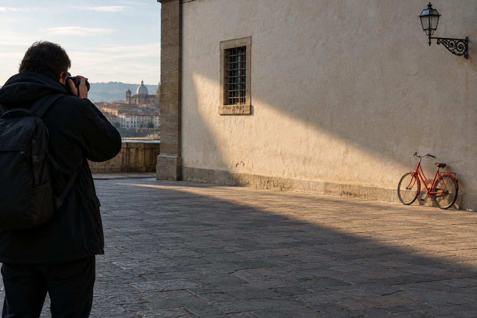
Imagine dividing your frame with two evenly spaced vertical lines and two horizontal lines. The rule of thirds suggests placing a significant subject near one of those lines or where two lines cross. For a landscape, you might put the horizon near the upper third to give more space to the foreground. For a portrait, you might place the person to one side and leave room in the direction they are looking.
The grid does not make an image good by itself. Its value is that it prompts you to decide what deserves space. Moving a subject away from the center can make its surroundings more visible, which may help tell the story: a walker within a wide landscape, for example, or a cook working in a busy kitchen. The result depends on what fills the rest of the frame, not just where the subject lands.
When the grid is a helpful starting point
Use thirds when a frame has two elements competing for attention, such as a person and the setting around them. Placing the person near a vertical third can give both elements a role. Before taking the picture, look into the open space: does it contain useful context, or just clutter? If it is clutter, changing your position may do more for the photograph than shifting the subject along the grid.
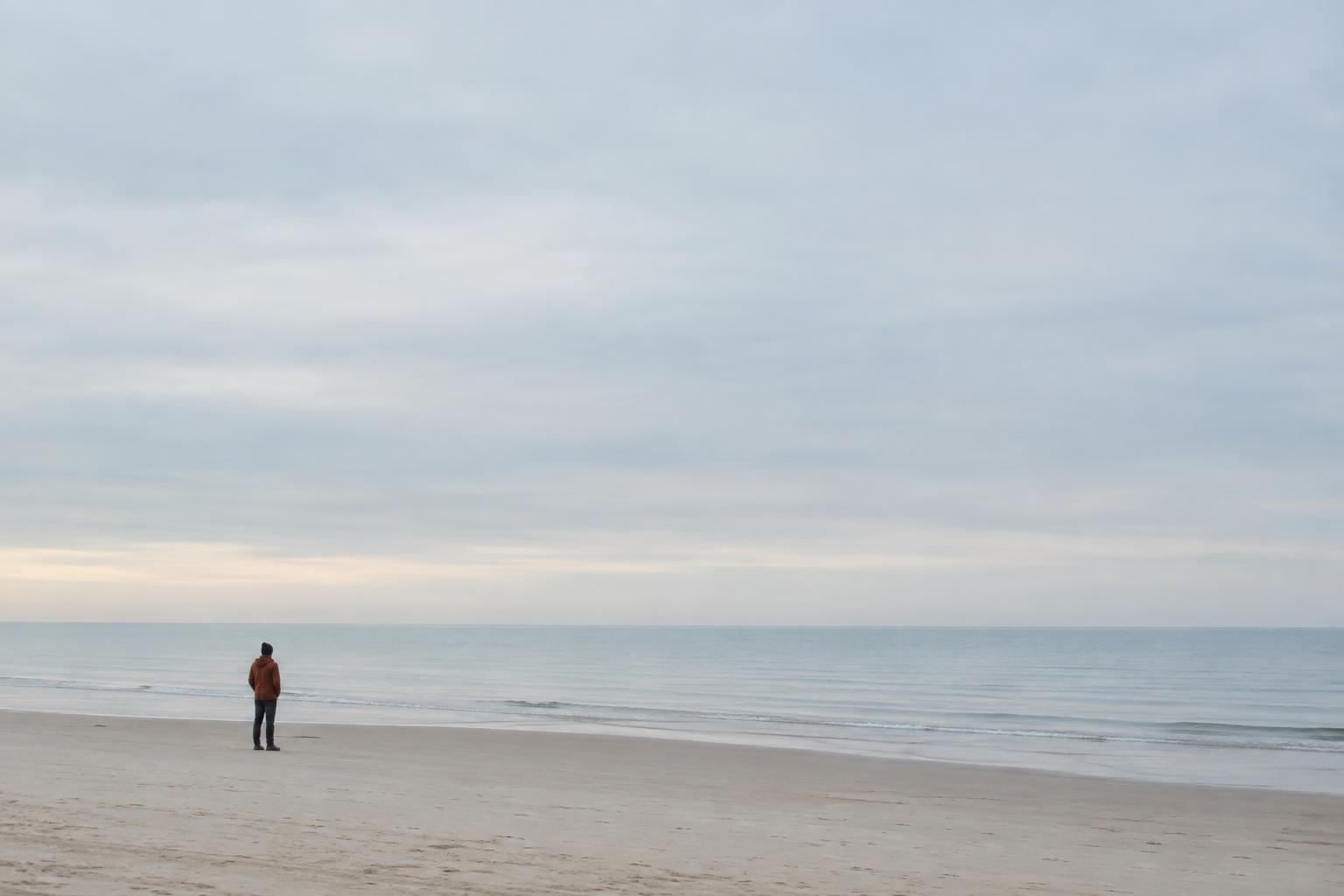
The horizontal lines can also help you choose how much ground or sky to include. If textured sand or a winding path is the point of the image, a higher horizon gives it room. If clouds are the main event, a lower horizon may serve better. Neither placement is automatic; the useful question is which part of the scene earns the larger share of the frame.
Many cameras and phone apps can display a thirds grid, but you do not need one to use the idea. Treat it as a quick check while composing, then pay attention to the edges. A bright sign, a partial object, or an unwanted branch can pull the eye away even when your subject sits neatly on an intersection.
When to break the rule
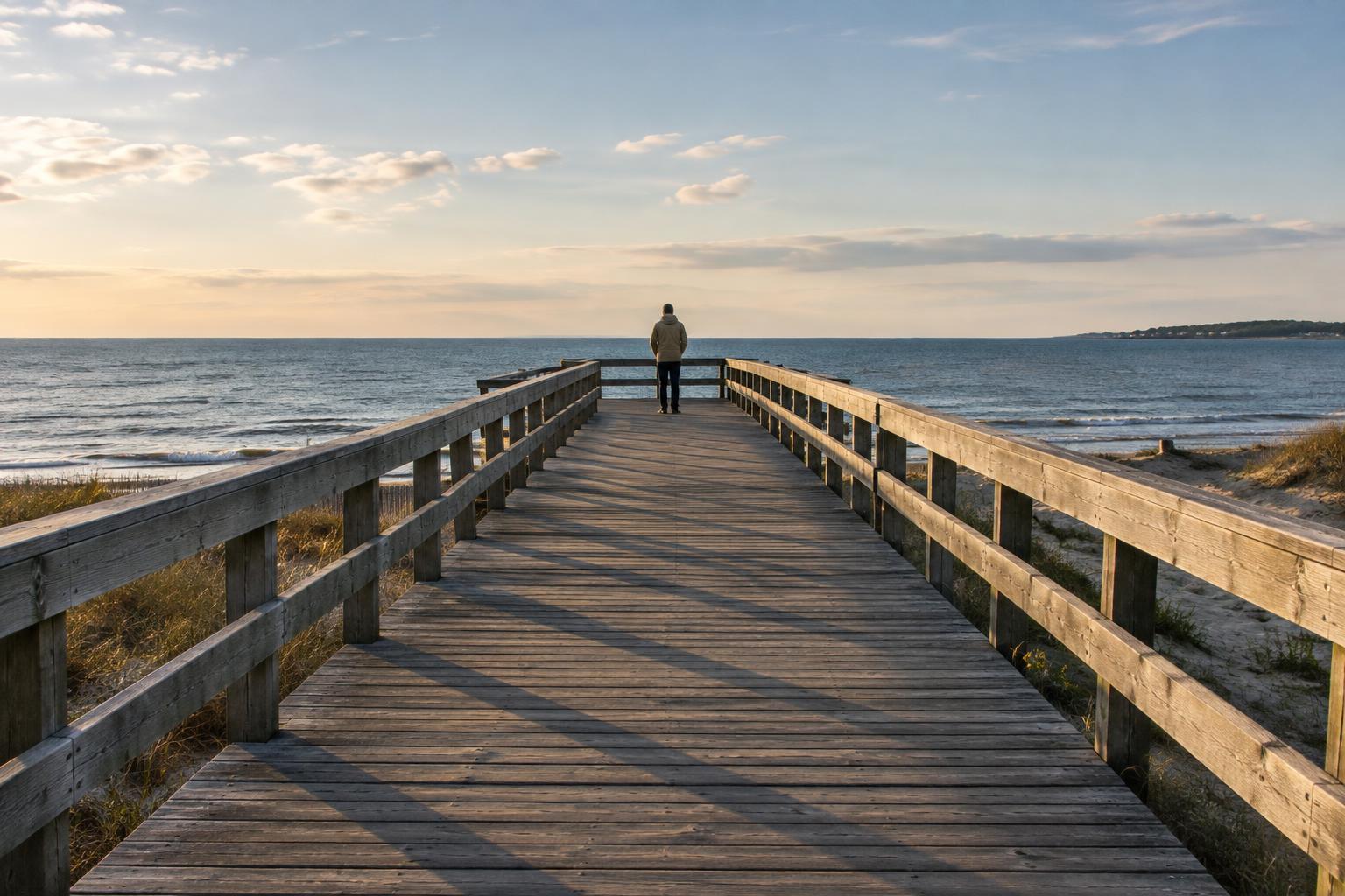
Centering a subject can create a sense of stillness or directness. It often suits reflections, repeating architecture, and portraits where eye contact is the main event. A symmetrical scene may lose its strongest feature if you push the subject to a third simply to follow the grid. In those cases, check that the frame is centered with care: a small tilt or uneven margin can be more distracting when symmetry is the goal.
You may also want an intentionally unbalanced frame. A tiny subject near an edge can emphasize the scale of a vast space, while a close subject filling most of the image can feel immediate and energetic. These choices work best when they clarify an idea rather than happen by accident. If a photograph feels unsettled, ask whether that tension supports what you wanted to show.
There is no need to force a subject onto an exact line. Light, color, contrast, and direction of movement all affect where the viewer looks. A bright face against a dark wall may remain the clear focus almost anywhere in the frame.
Compose for relationships, not coordinates
Before applying any grid, identify the main subject and what you want the viewer to notice next. If someone is looking or moving across the frame, leaving space ahead of them can make that direction easier to read. But space behind them might be more meaningful if they are walking away from a place that matters to the story. The grid offers a way to arrange these relationships, not an answer to what they should be.
Try shifting your own position before reaching for a different lens or cropping later. A step left may separate a person from a busy background; crouching may place them against a clean stretch of sky. Watch how background lines meet the subject, especially around faces. A composition can feel stronger because of one small change in viewpoint, even if the subject stays in roughly the same part of the frame.
A simple exercise for seeing the difference
Choose one stationary subject in a place where you can move safely. Make three photographs: one with the subject near a third, one centered, and one deliberately close to an edge. Keep your distance and camera height similar at first so placement is the main change. Then make another set while changing your position to improve the background. This separates the effect of the grid from the effect of your viewpoint.
Review the images side by side. Where does your eye go first, and what does it notice second? Does the empty space add information, provide breathing room, or feel unused? If you edit the photographs, experiment with a few crops, but leave enough room around the subject to avoid awkwardly cutting off gestures or important context. Save both the original and your preferred crop so you can compare them.
The aim is not to find the correct version of the scene. It is to recognize what each arrangement communicates. Once you can explain why a third, a center, or an edge serves your subject, the rule becomes a tool you can use—or set aside—on purpose.